Visibility
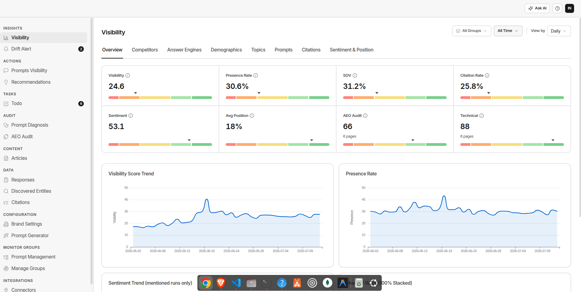
The Analytics Dashboard is your central view of how your brand's AI visibility is changing over time. It's organised into eight tabs, each covering a different dimension of your performance.
Dashboard Tabs
1. Overview Tab
Your top-level visibility health at a glance: eight KPI cards up top, followed by trend charts.
KPI Cards
Eight cards, each with a current value and a gauge:
| KPI | What It Measures |
|---|---|
| Visibility | Your overall 0-100 visibility score |
| Presence Rate | How often you appeared in responses at all |
| Share of Voice | Your share of all brand and competitor mentions |
| Citation Rate | Share of responses that cited your domain as a source |
| Sentiment | Average tone of mentions |
| Avg Position | How early you're typically mentioned, relative to competitors |
| AEO Audit | Your site's average AEO Health score, from AEO Audit |
| Technical | Your site's average Technical Health score, also from AEO Audit |
Trend Charts
Four charts, in a 2x2 grid:
- Visibility Score Trend - your overall score over time
- Presence Rate - how often you're mentioned at all, over time
- Sentiment Trend - average tone over time, across mentioned runs only
- Share of Voice (100% Stacked) - your share of mentions vs each tracked competitor, stacked over time
| Pattern | What It Means |
|---|---|
| Steady upward slope on Visibility | Content investment is working |
| Sudden drop | Investigate immediately - check Responses for the affected prompts |
| Flat despite publishing | New content isn't earning AI citations yet. Allow 4-6 weeks |
| Gradual decline | Competitors are gaining ground. Check the Competitors tab |
2. Competitors Tab
Where you stand against each tracked competitor, three ways.
Share of Voice - Totals
A bar chart of total mentions per entity - you and each tracked competitor, side by side.
| Share of Voice | What It Means |
|---|---|
| Rising | You're getting mentioned more relative to competitors |
| Falling | Competitors are taking more of the AI conversation |
| Flat | Holding position - not gaining or losing ground |
Win Rate vs Competitors (Head-to-Head)
For each tracked competitor: how many prompts you both appear on, how many are yours only, how many are theirs only, and how many neither of you appear on - plus an overall win rate. Click through to drill into the underlying responses.
Use this to find which competitors you're consistently losing to, then focus content on those specific comparison and alternative prompts.
Position Battle
Average and best position percentile per entity, alongside mention count. Lower percentile means earlier in the response, which reads as a stronger recommendation.
3. Answer Engines Tab
How your visibility breaks down across the AI platforms GrackerAI monitors: ChatGPT, Perplexity, Google AI Mode, Google AI Overview, Copilot, Grok, and Gemini.
By Answer Engine
A table with Visibility Score, Presence Rate, Sentiment, and Runs per platform, with drill-down into the underlying data.
| Gap Pattern | What It Usually Means |
|---|---|
| Strong Perplexity, weak ChatGPT | Mainstream content gap - get into broader publications and directories |
| Strong ChatGPT, weak Gemini | Community/video content gap - Reddit, YouTube, forums |
| Weak across all surfaces | Fundamental authority gap - start with foundational content |
| Weak on Copilot only | Enterprise content gap - case studies, compliance docs, analyst coverage |
Answer Engine x Entity Mentions
A matrix with one column per AI platform, showing mention counts for you and each competitor, with a total column - so you can see at a glance which platform is driving a competitor's lead.
4. Demographics Tab
How your visibility breaks down by market.
By Country
Visibility Score, Presence Rate, Sentiment, and Runs per country your monitor groups target. Useful when you run monitors for multiple markets and want to see which geographies are driving score changes.
Language Coverage
Runs broken down by language and platform, with Presence Rate, Visibility Score, and Runs - so you can spot a language your monitoring hasn't covered well yet.
5. Topics Tab
A heatmap table: rows are your brand's topics (plus "Uncategorized"), columns are you and your tracked competitors. Each cell shows that entity's share of all mentions within that topic - each row adds up to roughly 100%.
Green means a dominant share of a topic's conversation, amber means a contested middle share, red means a low share you're losing.
6. Prompts Tab
Tracks visibility at the individual prompt level, split into three lists.
Weakest Prompts
Your bottom 10 prompts by visibility score. Start here to find your biggest content gaps.
Strongest Prompts
Your top 10 prompts by score (where you have a score above zero) - the prompts already working, worth defending.
Lost Prompts
Prompts where a competitor is mentioned but your brand never was, over the selected window. A competitor has already earned AI's trust for that query and you haven't yet. These are your highest-value content opportunities - read the actual responses to see why.
Each list shows Prompt, Visibility Score, Presence Rate, Sentiment, Runs, and Last Seen (Lost Prompts show Runs, Avg Competitor Mentions, and Last Run instead). Click any row to open the prompt's detail view.
7. Citations Tab
Tracks which websites AI trusts most in your category, four ways.
Competitor Citation Comparison
A line chart of citation counts per day, for you and each tracked competitor.
Citation Mix
A breakdown of citations into three buckets - your own domain, competitor domains, and neutral third-party sources. If your own domain is rarely cited, AI is referencing you but not linking to you as a source - a structural content problem needing clearer positioning and schema.
Citation Source Types
A breakdown by source type - Blog, Forum, Review Site, Code Repository, Video, Wikipedia, Marketplace, Academic, News, Press Release, Social Media, Official Docs, and Podcast - so you can see whether your category leans toward community platforms, media, or vendor content.
Citation Trend
A stacked area chart of brand, competitor, and neutral citations over time.
8. Sentiment & Position Tab
Tracks the tone of how AI describes your brand, and where you land in the response.
Sentiment Drift
Your average sentiment score over time, shown alongside your top competitors. Watch for:
- Declining trend - AI is describing you less favourably. A visibility drop usually follows 4-8 weeks later.
- Sudden negative spike - Usually traces to a specific source: a new negative review, a competitor's comparison page, or outdated content.
Sentiment Distribution
A histogram of your mentions across sentiment bands, from strongly negative to strongly positive. A healthy distribution for most B2B brands is 60%+ positive, under 10% negative. If negative exceeds 20%, investigate the source.
Position Distribution
Your mentions and your competitors' mentions bucketed into three tiers by where in the response they land: Hero (earliest third), Middle, and Tail (latest third). A brand with most of its mentions in the Hero tier reads as the default recommendation; one stuck in the Tail reads as an afterthought, independent of sentiment.
Common Reporting Cadences
| Cadence | What to Review |
|---|---|
| Weekly | Overview trend, weakest and lost prompts |
| Monthly | Full dashboard, Sentiment & Position, Citations, new/lost domains |
| Quarterly | All tabs, Competitors tab win rates, Topics tab |
For report templates and export guidance, see Reporting & Exports.