Optimizing B2B SaaS Conversion Funnels with AI-Driven UX Insights

Running a B2B SaaS business often feels like you are trying to fill a bucket that has dozens of tiny holes in it. You spend a lot of money on ads. You work hard on your social media. You write blog posts to get people to visit your site. But for some reason, the visitors just don’t turn into paying customers.
They land on your homepage, scroll for a few seconds, and then leave. Or worse, they start the signup process but quit halfway through. This is what we call a leaky funnel.
In this guide, we are going to talk about how to fix those leaks. We will look at how modern data and smart tools can help you understand exactly why people are leaving. By using deep insights into how users behave, you can make small changes that lead to huge growth.
What Exactly is a B2B SaaS Conversion Funnel?
Before we talk about fixing the funnel, we need to understand what it is. In the world of business software, the funnel is the path a person takes from the moment they first hear about you until they become a loyal, paying user.
Unlike buying a pair of shoes online, buying software for a business takes time. It involves more than one person, and it usually costs more money. Because of this, the funnel is broken down into a few main stages:
The Awareness Stage
This is the top of the funnel. This is when a person realizes they have a problem and starts looking for a solution. They might find you through a search engine or a LinkedIn post. At this stage, your website needs to be clear and helpful.
The Consideration Stage
Now, the person knows who you are. They are comparing you to your competitors. They are looking at your features, reading your reviews, and trying to decide if your tool is worth the price.
The Decision Stage
This is the bottom of the funnel. The user is ready to sign up for a trial or talk to a sales rep. This is the most sensitive part of the journey. If your signup form is too long or your pricing page is confusing, you will lose them.
Why Standard Analytics Aren't Enough Anymore
Most business owners use basic tools to see how many people visit their site. They look at page views or bounce rates. While these numbers are okay, they don't tell the whole story.
A high bounce rate tells you that people are leaving, but it doesn't tell you why. Did they leave because the text was too small? Did they leave because the Sign Up button didn't work on their phone?
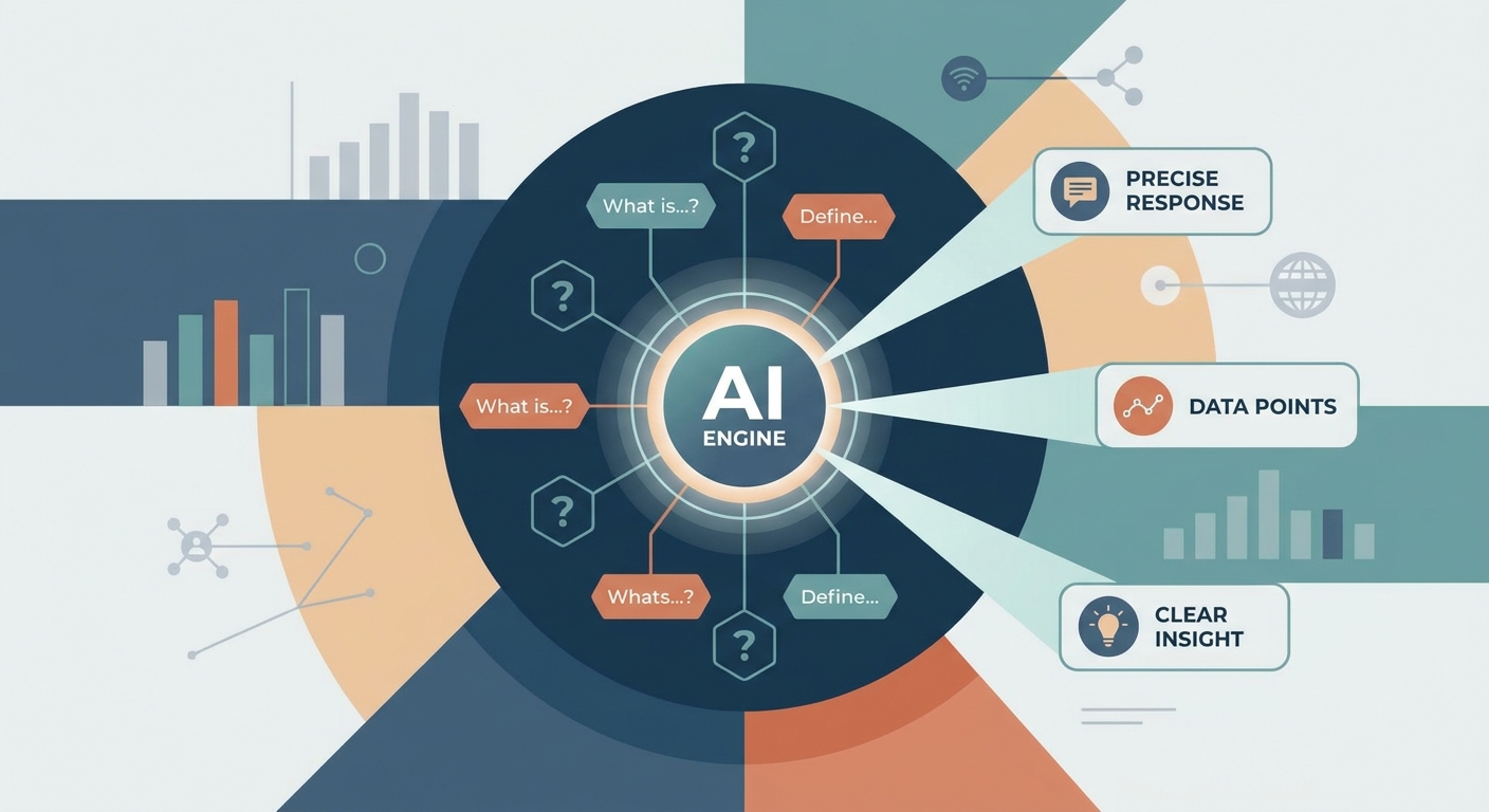
This is where advanced UX insights come into play. By using smart technology to track mouse movements, clicks, and scrolling habits, you get to see your website through the eyes of your customers.
When you use a professional platform like Uxify, you stop guessing. You start seeing the real roadblocks that are stopping your growth.
Fixing the Top of the Funnel: Making a Great First Impression
The first few seconds a person spends on your site are the most important. In B2B SaaS, users are usually busy professionals. They don’t have time to solve a riddle to figure out what your software does.
Simplify Your Value Proposition
If a user has to scroll down three times to find out what you sell, they will leave. Your headline should be bold and simple.
Bad Example: We provide holistic ecosystem solutions for enterprise-level synergy. (Too complex!)
Good Example: Get your team’s project reports done in half the time. (Simple and clear.)
Use Smart Data to See Where People Look
Modern tools can show you heatmaps. These are visual maps that show where people are clicking and looking the most. If you see that everyone is clicking on a photo that isn't a link, you should probably make that photo a link! Or, if people are ignoring your main Get Started button because it's in a weird spot, you can move it to where their eyes actually land.
The Middle of the Funnel: Building Trust and Showing Value
Once someone is interested, they move into the middle of the funnel. In B2B, this is where most sales are lost. Users are looking for proof that your software actually works.
The Problem with Information Overload
A common mistake SaaS companies make is putting too much information on one page. You want to show off every single feature you have built, but this often overwhelms the reader.
Instead, use intelligent insights to see which features people actually care about. If data shows that 80% of your users go straight to your Integrations page, make sure that page is perfect. If no one ever visits your Awards page, you might not need it in your main menu.
Using Real-Life Stories
Humans trust other humans more than they trust brands. Including case studies or testimonials near your call-to-action buttons can help.
Real-Life Example: Imagine a marketing manager named Sarah. She’s looking for an email tool. She’s on the fence about your software. Right next to the Start Free Trial button, she sees a quote from another marketing manager saying, This tool saved me 5 hours a week. That one sentence might be the reason she finally clicks.
The Bottom of the Funnel: The Final Hurdle
The bottom of the funnel is where the actual conversion happens. This is usually your Pricing page and your Sign Up page.
Pricing Page Clarity
Pricing pages are often the most confusing part of a B2B site. Are the prices monthly or yearly? What features come with the Pro plan?
If you use smart behavioral tracking, you might notice that users spend a lot of time hovering over a specific term in your pricing table. This is a sign that they don't understand what that term means. Adding a small info bubble or a simpler explanation can fix this instantly.
The Signup Process
Every extra field you add to a signup form reduces your chances of getting a customer. Do you really need their phone number, company size, and job title right now?
Probably not.
Try to keep your signup form to just an email and a password. You can ask for more details later once they are inside the app. Using tools like Uxify can help you identify exactly which part of the form makes people quit.
5 Quick Tips to Improve Your Funnel Today
If you want to start seeing better results immediately, here is a checklist of things you can check on your website:
Check your loading speed: If your site takes more than 3 seconds to load, half of your visitors will leave before they even see your logo.
Make buttons stand out: Use a color that isn't used anywhere else on the page for your main Sign Up or Book a Demo buttons.
Optimize for mobile: Many B2B buyers do their initial research on their phones during breaks or commutes. If your site looks broken on a phone, you lose credibility.
Use Social Proof: Place logos of companies that use your software right under your main headline.
Watch your users: Use session recording tools to watch a few minutes of how real people move through your site. You will be shocked at what you learn.
The Power of Continuous Learning
The biggest secret to a high-converting B2B SaaS funnel is that it is never finished. The market changes, your competitors change, and your users' needs change.
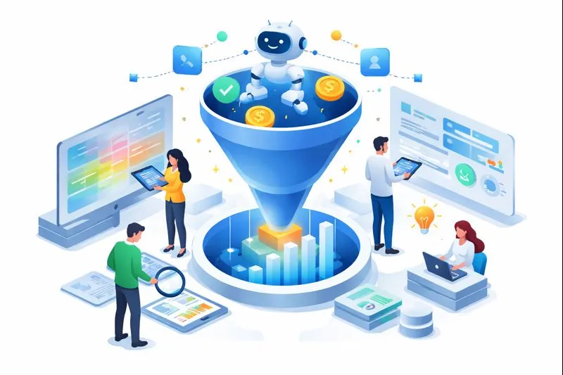
The best companies are the ones that never stop looking at their data. They don't just guess what their customers want; they use smart insights to prove it. They look at the journey from the user's perspective and constantly remove the friction.
When you focus on the user experience (UX), you aren't just making a pretty website. You are building a path that makes it easy for your customers to say Yes.
Conclusion
Optimizing your B2B SaaS conversion funnel doesn't have to be a mystery. You don't need to be a professional designer or a math genius to see where your site is failing.
By paying attention to how people actually use your site—where they click, where they stop, and where they get confused—you can turn your website into a powerful sales machine. Remember to keep your language simple, your goals clear, and your focus on the user.
If you are ready to stop guessing and start growing, it's time to get a deeper look at your website's performance. Tools that provide intelligent UX insights are the key to unlocking your true potential.